Color has the profound ability to influence our emotions, behavior, and even physiological responses. When thoughtfully applied, color psychology can transform a home from merely functional to a place that uplifts, relaxes, and energizes its occupants. Whether designing a serene coastal retreat in Ship Bottom, NJ, or a vibrant city apartment, understanding how color works can be the key to creating a space that feels truly personal and balanced. This article explores the psychology behind different hues and offers practical guidance on using color to create an intentional, emotionally supportive home environment.
The Science Behind Color Psychology
Color psychology is the study of how colors affect human emotions and behavior. While individual responses to color can vary due to personal and cultural influences, there are general associations that tend to hold true across populations. For example, warm colors like red, orange, and yellow tend to evoke energy and warmth, while cool colors such as blue, green, and purple are associated with calmness and relaxation. These associations are rooted in both biological responses and societal conditioning. By leveraging these psychological effects, homeowners can design spaces that align with their mood, function, and lifestyle goals.
Choosing a Mood for Each Room
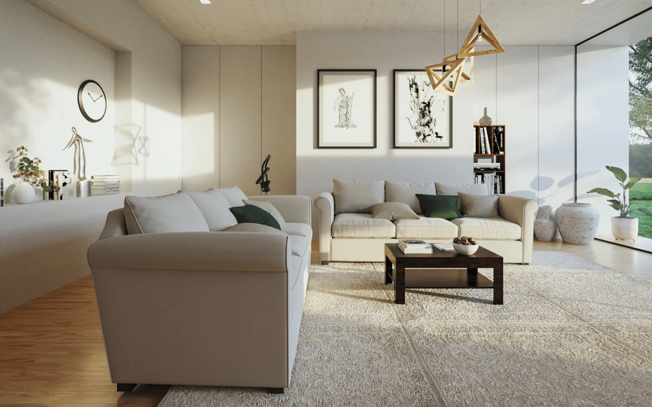
Every room in the home serves a different purpose, and the color palette should reflect the intended emotional atmosphere. For bedrooms, soft, cool tones like lavender, soft gray, or pastel blue encourage relaxation and better sleep. Living rooms often benefit from warm, inviting colors such as beige, terracotta, or soft green to promote conversation and connection. Kitchens, being hubs of energy and creativity, can thrive with cheerful yellows or invigorating reds. For homeowners in Ship Bottom, NJ, coastal-inspired palettes with shades of sand, seafoam, and pale blues can reflect the area's serene natural surroundings while enhancing the home's character.
Calming with Cool Tones
Cool tones—particularly blues and greens—have a calming effect on the mind and body. Blue is frequently associated with peace, stability, and trust, making it an excellent choice for bedrooms, bathrooms, or any space intended for rest and reflection. Green, symbolizing nature and renewal, can reduce stress and eye strain while promoting a sense of balance and freshness. For residents of Ship Bottom, NJ, incorporating ocean-inspired cool hues into beachside homes can help reinforce a tranquil atmosphere that harmonizes with the coastal environment.
Energizing with Warm Hues
Warm hues, including red, orange, and yellow, are known for their stimulating and mood-boosting properties. These colors are ideal for spaces where activity, creativity, and socialization occur. For instance, a dining room with warm orange accents can stimulate appetite and conversation, while a home office with touches of yellow may enhance focus and positivity. In moderation, red can bring passion and vibrancy to a space but should be balanced to avoid overstimulation. Using warm tones strategically allows homeowners to create an energizing flow without overwhelming the senses.
The Power of Neutrals and Earth Tones
Neutrals like white, gray, beige, and taupe serve as versatile backdrops that offer balance and timeless elegance. Earth tones—such as clay, ochre, and moss—can add depth and a grounded, organic feel to any space. These colors are especially popular in contemporary and minimalist design but can also serve to accentuate bolder choices. In coastal communities like Ship Bottom, NJ, sandy beiges and driftwood grays reflect the natural landscape while offering warmth and sophistication. Layering these hues with textured materials such as wood, linen, and stone further enhances their sensory impact.
Using Accent Colors to Make a Statement
Accent colors allow homeowners to introduce personality and drama without committing to a full-room overhaul. Whether through artwork, throw pillows, rugs, or feature walls, accents add visual interest and can reinforce the emotional tone of a space. For example, a deep navy accent wall in a neutral bedroom can introduce depth and calmness, while a pop of coral in a neutral-toned living room can add a refreshing burst of energy. In Ship Bottom, NJ, homes, using ocean-inspired accents like teal, coral, or sun-washed terracotta can infuse spaces with local character and charm.
The Role of Lighting in Color Perception
Natural and artificial lighting significantly influence how color is perceived. A paint that appears warm and golden in daylight might look dull or cold under fluorescent lighting. Therefore, it's essential to test paint samples in different lighting conditions before committing. Coastal homes in Ship Bottom, NJ, often enjoy abundant natural light, which can enhance the brightness and subtle undertones of color palettes. Homeowners should also consider lightbulb temperature—warm bulbs for cozy settings, cool ones for modern spaces—to ensure color choices retain their intended effect throughout the day.
Color and Spatial Perception
Color can visually alter the size and shape of a room. Light colors tend to make spaces feel larger and more open, while darker shades create intimacy and coziness. A small room painted in a soft off-white or pastel can appear more expansive, while a large room with high ceilings might feel more grounded and inviting with a warm charcoal or navy tone. In the design of homes in compact coastal areas like Ship Bottom, NJ, this technique is especially useful for optimizing space and light, creating a more functional and welcoming atmosphere.
Psychological Color Associations to Consider
While personal preferences matter, general psychological responses to color can serve as useful guidelines. For example:
- Red: Passion, energy, urgency
- Orange: Optimism, enthusiasm, sociability
- Yellow: Cheerfulness, intellect, warmth
- Green: Growth, harmony, freshness
- Blue: Trust, calm, productivity
- Purple: Creativity, luxury, introspection
- Brown: Stability, reliability, comfort
- White: Cleanliness, simplicity, peace
- Gray: Balance, neutrality, sophistication
- Black: Elegance, power, mystery
Understanding these associations helps homeowners craft spaces that intentionally support emotional well-being and functionality.
When to Consult a Design Professional
While many homeowners enjoy experimenting with color on their own, consulting with an interior designer or color specialist can provide personalized insight and avoid costly mistakes. Professionals consider factors like lighting, architecture, existing décor, and psychological objectives when building a color scheme. Especially in areas like Ship Bottom, NJ, where real estate aesthetics can influence vacation rentals or resale value, expert guidance can ensure that color choices are both visually appealing and strategically valuable.
A More Beautiful Home, One Shade at a Time
Color is more than mere decoration—it's a tool that, when used effectively, can redefine how a home feels and functions. From energizing yellows in the kitchen to soothing blues in the bedroom, thoughtful color selection allows homeowners to craft intentional living environments that reflect their needs and aspirations. In scenic locales like Ship Bottom, NJ, integrating the emotional power of color with natural coastal inspiration can enhance not just visual harmony but emotional well-being. By embracing the psychology of color, homeowners gain more than style—they create meaningful experiences in every room.
Unlock the Potential of Your Property
At The Beach House Group | SERHANT, we understand how much color and design influence a home’s appeal and livability. We offer expert guidance for homeowners and real estate investors looking to optimize property value and emotional resonance. Whether you’re buying, selling, or staging a home in Ship Bottom, NJ, or beyond, we are committed to helping you create spaces that feel as good as they look. Let our insight transform your real estate journey.